I’ve been on a bit of a quest to find out how many responsive websites are out there. In a recent post, I describe a decent way to track the adoption rate of the “One Web” concept, but that technique doesn’t work well for tracking responsive design.
Now, I think I found the trick for automatically identifying a responsive site.
The trick: A Horizontal Scrollbar on a Small Screen
That’s it. A simple test, and in fact – as a designer friend of mine pointed out – a technique used for implementing responsiveness before media queries and the term RWD existed.
My proposition is that if you take a non-responsive website and load it in a small browser window, a horizontal scrollbar will show up. However, if the website is responsive, it will magically adjust to the display size, and a scrollbar will not be needed.
I tested this out on a bunch of sites manually, and my theory seemed to hold true. I opened my Chrome window, resized it to be 320pixels wide, and started loading known responsive websites, such as Boston Globe, Starbucks, and the recently responsive Bloomberg. No scroll bar appeared. I tried out various non-responsive websites (plenty of those around), and a scrollbar was always there.
And so, I went ahead and automated a test.
Testing The Test
I wrote a small piece of JavaScript that compares the window.innerWidth value to the scrollWidth of the top elements on the page. If scrollWidth was bigger– the site was marked as not responsive.
I then used WebPageTest’s exec script command to load up a bunch of sites and run this test on them. I used the websites tested by the HTTP Archive as my sample set, as it lists websites in order of popularity across the web.
As a test run, I loaded the top 200 websites on a 480px wide Chrome window and manually vetted the results (I also tried 320px, which produced similar results – more on that in a future post). The results weren’t perfect, but were quite good.
Out of 23 identified RWD sites, only myspace.com, which has an unusual horizontal design, was incorrectly marked as responsive (although reddit has a not very usable panel too). Even more impressive was the fact only one of the 176 sites marked as non-responsive was wrong (tumblr was the exception).
You can check out the screenshots yourself (warning: some sites produced very explicit and NSFW shots)– responsive here and non-responsive here.
The Full Test – 10,000 Websites
For the full test, I ran the same setup on the top 10,000 websites, loading them again in a 480px wide Chrome window. As is common, a portion of the tests failed (due to temporary errors or invalid URLs in the list), making the total number less than 10,000, but close enough.
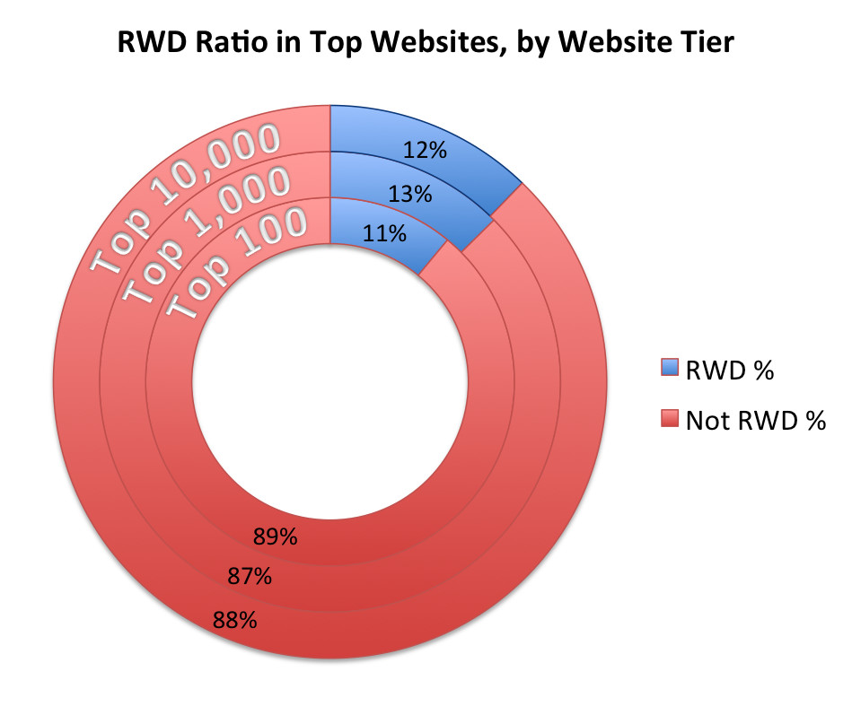
The following table and chart show the number and ratio of responsive websites for the full list, as well as the top 100 and top 1,000 websites.
| # RWD Sites, by Tier | Responsive | Non-Responsive | RWD Ratio |
|---|---|---|---|
| Top 100 | 11 | 89 | 11% |
| Top 1,000 | 126 | 874 | 12.6% |
| Top 10,000 | 1,129 | 8,102 | 12.2% |
As you can see, the results are fairly consistent, ranging from 11% to 12.6% across the different tiers. Almost 8% of sites failed to load, which is not uncommon when using generic lists.
While I could manually verify 200 URLs, doing the same for 10,000 was a bit much… In addition to assuming the results would be as accurate as the first 200, I came up with one external way to vet my results.
Secondary Verification: Mobile Redirects
In the mentioned recent post, I identified all the Mobile HTTP Archive websites that redirected to a mobile site. Since responsive websites usually replace a mobile site, I would expect to see practically no overlap between the list of RWD sites and the list of sites that redirect to mobile.
Comparing the two lists, I indeed only found 25 websites that were marked as both redirecting to a mobile site and responsive. This is quite small – only 2% of all marked responsive sites sites. It’s also substantially smaller than the 20% portion of all websites that redirect to mobile. Therefore, I see this as another affirmation of the test results.
After manually reviewing the 25 sites, I found a few sites that were mistakenly marked, as well as a few sites that indeed were both responsive and redirected iPhones to mobile, like Scribd, or that had an iPhone specific redirect but not a mobile website, like Opera.
Summary
I’m pretty excited about this new find – both the technique and the data.
Regarding the technique, I feel it’ll be a good (even if not perfect) way to track Responsive Design adoption over time. The data I have so far suggest 95% or more of the sites marked as responsive are indeed responsive, making it accurate enough to use. Beyond tracking adoption, now that we’ve found these sites we can analyze them and find recurring patterns, test performance methodologies and much more – I already have quite a few additional tests on the go…
Regarding the data, I’m actually quite impressed. I was well aware RWD is gaining adoption, but frankly did not expect almost every 8th site to be responsive! I am truly happy it’s getting such broad adoption, and a little freaked out at the performance implications of it, since very few responsive websites make the effort to be fast.
I’d love to get feedback on both data & technique, along with ideas for what to look into next with these new data sets. Please share your thoughts in the comments field or ping me on Twitter.
