Responsive Web Design is hot. Practically every company I speak to, around the globe, is either going responsive, has gone responsive, or – at the very least – giving it serious consideration. So, with all this buzz, how many websites are actually responsive?
To answer this question, I ran a test on the top 10,000 websites (per Alexa), and checked if they are responsive. This test was a repeat of a test I ran last year, and relies primarily on the presence of a horizontal scrollbar when loading the page on a small screen. If the scrollbar is there, it indicates the website didn’t adjust its styling to the display, and thus is not responsive. You can find the full test methodology in last year’s post.
I had the pleasure of presenting this data at the awesome Web Directions South 2014 (slides here), and in this post summarized the highlights. So, let’s get to the results!
RWD More Popular In The Long Tail
The chart and graphic below show the percentage of responsive websites amongst the top 100, 1,000 and 10,000 websites. As you can see, the adoption rate is quite substantial, reaching 18.7% adoption rate in the entire data set.
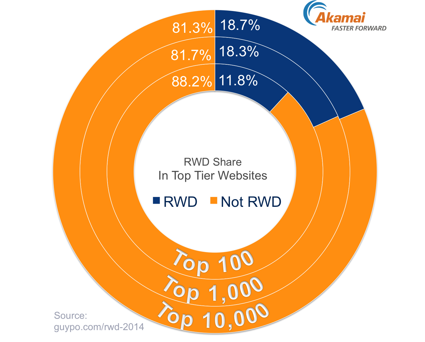
The adoption rate is noticeably lower in the very top sites. This may be due to costs, as the top sites can more easily pay for multiple separate websites. However, I believe the reason is more the higher agility of the lower tier sites. These sites often have less legacy code or internal politics than the ones at the very top, making the adoption of RWD easier.
| Top 100 | Top 1,000 | Top 10,000 | |
|---|---|---|---|
| RWD | 11.8% | 18.3% | 18.7% |
| Non RWD | 88.2% | 81.7% | 81.3% |
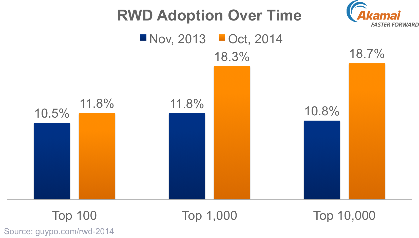
RWD Adoption Growing Fast
The next chart shows the difference between this year’s results and the test I ran last year. As you can see, adoption has grown substantially in the top 1,000 websites and above. Amongst the top 10,000 websites, almost 8% of websites went responsive within the span of a single year – an incredible growth!
It’s worth noting that this test used the same URLs used in last year’s test, and so this adoption represents actual changes on the same websites. It’ll also be interesting to explore the percentage of RWD sites amongst the 2014 top sites vs. the 2013 top sites, but this test did not capture that case.
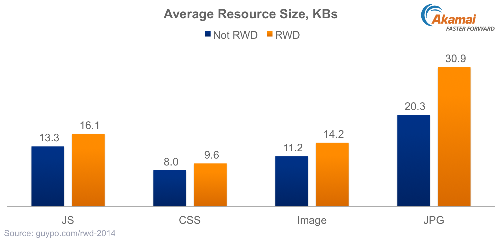
RWD Sites Use Large Resources
Comparing RWD sites to other websites on desktop shows responsive websites use fewer requests, with a median of 74 requests per page compared to 95 on non-responsive ones. However, the median page weight was practically the same, (roughly 1.1MB) for both types of sites.
This apparent discrepancy is due to the fact responsive websites use larger resources. As the chart below shows, the average size of a JS or CSS file is more than 20% larger on an RWD site. This increase may be due to the higher complexity of the page, as it can support multiple viewport at once.
Images are roughly 27% larger on a responsive site, and JPEG images are a staggering 50% heavier! Once again, various reasons may lead to this delta, one of which is the more frequent use of high resolution (“Retina”) images on responsive sites. Mobile displays have a high pixel ratio more often than desktop ones, driving more interest in HD images, which are often (wastefully) used for all clients.
RWD Sites Still Over Download
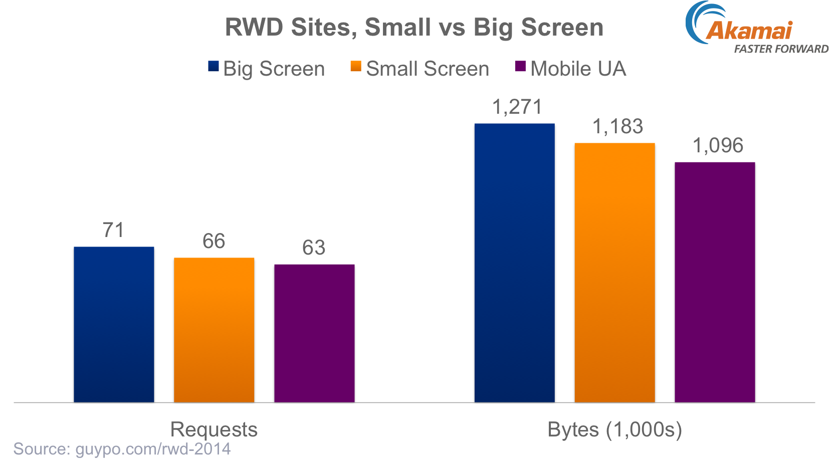
So far we’ve compared RWD sites to non-RWD sites. Another interesting view is the difference in page composition when loading an RWD sites on a small vs. a big screen. For most responsive sites, a smaller screen will present users with less content or functionality, for instance hiding some images or social sharing buttons, or shrinking down some images.
That difference, however, is not reflected in page size. The chart below shows the number of requests and bytes used when loading a web page on a small and big screen. In both of those cases, the User-Agent was that of a desktop browser (Chrome), while the third column shows data for loads on a small screen as well as a Mobile User-Agent.
As you can see, the delta is not big. RWD pages used a mere 7% fewer requests or bytes on a small screen, despite substantial differences in the amount of content displayed. Using a Mobile User Agent led to a bit more savings, combining for ~13% savings in bytes and requests. This may indicate that some responsive websites employ RESS, tuning the content served to the client if it’s a mobile device.
RWD Sites almost as popular as Mobile Websites
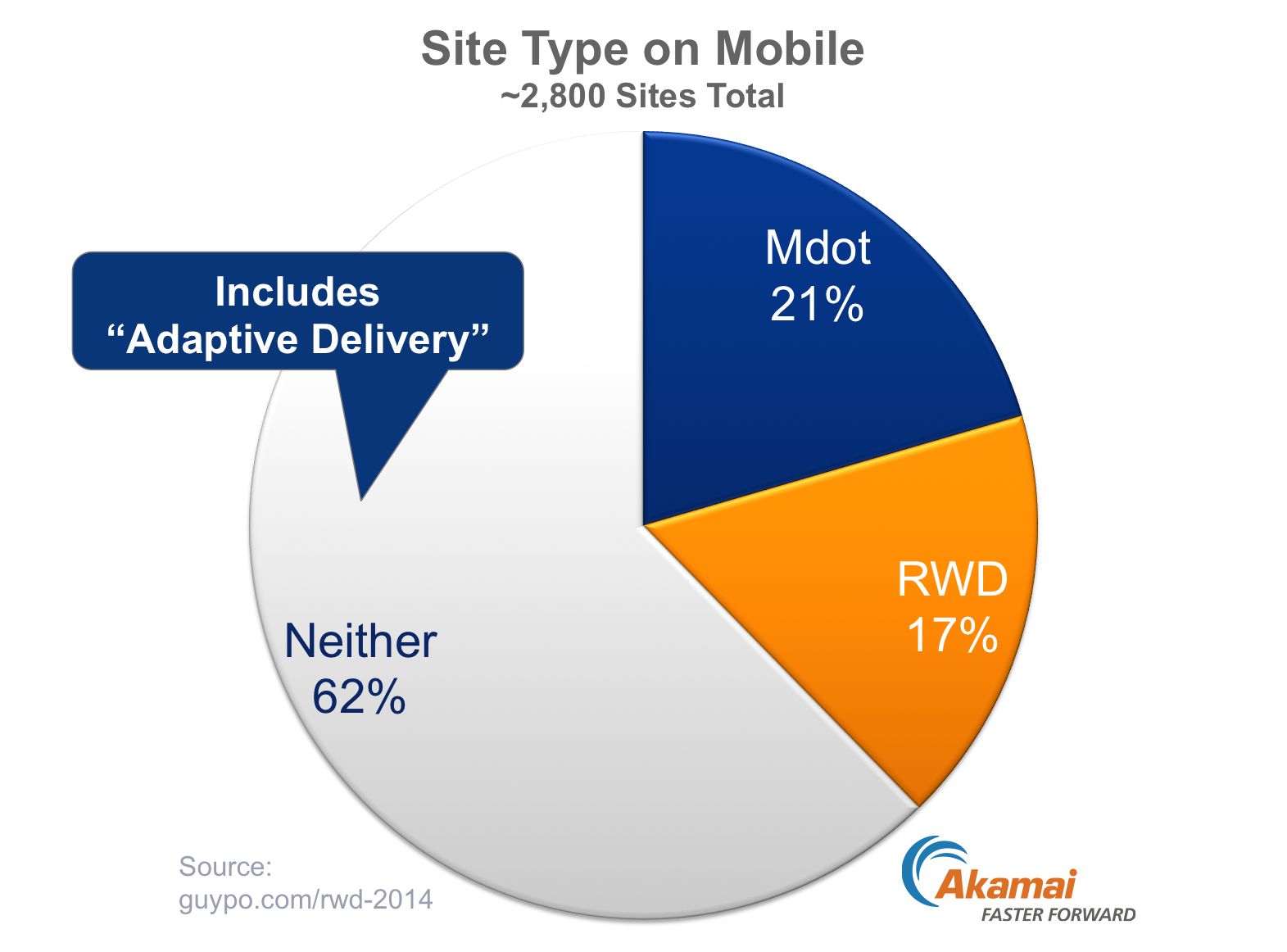
Another way to look at adoption is to compare it to the alternate mobile strategy – a dedicated mobile (“mdot”) site. To do so, I looked at the intersection of websites that appeared in both my set and in HTTP Archive Mobile, which – after some filtering of errors – left me with roughly 2,800 websites, all within the Alexa top 5,000. Not quite 10,000, but still a sizeable sample.
Amongst those sites, we can see that 17.2% of websites used RWD, 20.5% redirected to a mobile website, and the remaining 62.3% did neither. This is a limited perspective, as some of the “Neither” sites use Adaptive Delivery (using the same URL, but returning a different HTML to mobile clients). In addition, many of the mobile specific sites use RWD, responding to client fragmentation within the “mobile” group. Still, it’s interesting to see RWD is already almost as popular as a Mobile only site.
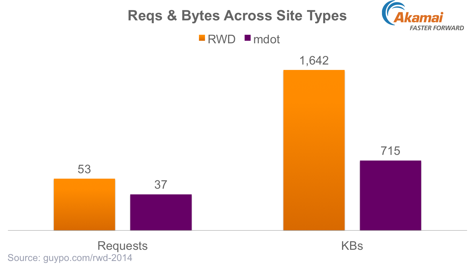
RWD Sites Are Heavier Than Mobile Sites
Now that we have a set of mobile sites and a set of responsive one, we can compare some performance characteristics of these two ways to handle the mobile web. As the next chart shows, mobile websites are substantially smaller than responsive sites. A median mobile site used less than half the bytes and roughly 30% fewer requests than its responsive peer.
Note that the absolute numbers are different than those we saw in the previous charts, for two reasons. The first is the smaller data set, and the second is the loading of these sites on real mobile devices. In the previous test, we simulated mobile, but now that we had a smaller test, I actually loaded the pages (both the Mobile and RWD ones) on a real mobile device (Moto G).
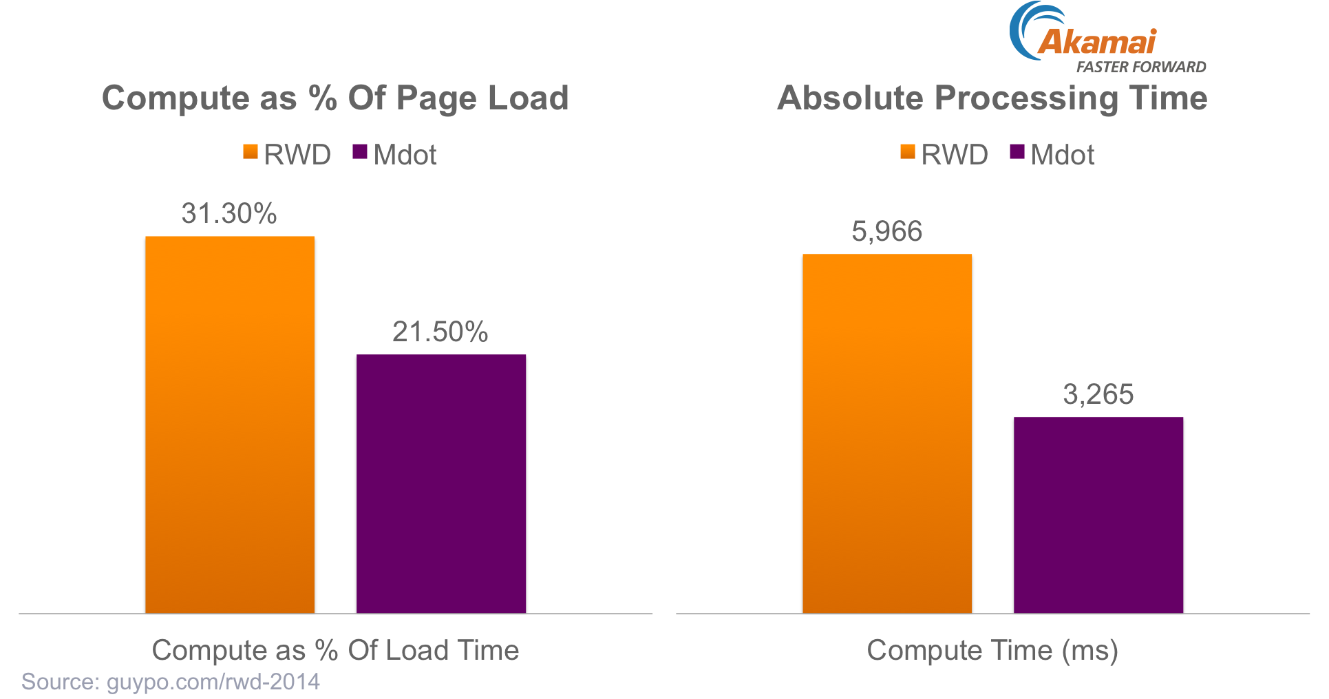
Processing RWD Sites on Mobile Is Expensive
One oft-discounted part of page load time is processing time, despite the fact it is a significant contributor to page speed. In this test, I used Chrome Dev Tools to capture the amount of processing time used with every page. This includes steps such as parsing JavaScript, rendering layout, painting on the screen, etc.
Once again, I compared processing time for RWD sites to that of Mobile sites, guessing that the higher complexity of responsive websites would require more compute. And indeed, as the chart below shows, that guess proved true. The two charts show the processing time in absolute CPU seconds and as a percentage of overall page load time. In both cases, a responsive website required the device (Moto-G, a $200 Android device) to spend much more time running the program that is the site, therefore slowing it down.
Summary
Responsive Web Design adoption is growing rapidly, and is already nearing the adoption levels of a dedicated mobile site. Unfortunately, this fast adoption of RWD is moving faster than the attention to its performance. Current RWD sites perform better than desktop sites in various aspects, but are substantially heavier and more complex on mobile, compared to the alternative – a dedicated mobile site.
In my opinion, this does not mean you should stick to dedicated mobile websites as your strategy. In today’s web (and tomorrow’s web), arbitrarily separating “mobile” from not is doomed to fail, and approaches like RWD are required if we’re to properly serve the fast pace and fragmented device landscape. However, mobile websites gave us some freebies when it comes to performance, and when using RWD, and the more complex pages it requires, we lose those discounts. We have to own our performance.
As an industry, we should keep encouraging the use of RWD, but at the same time we have to double our efforts in building knowledge and tooling for making responsive websites fast. So pick up an RWD Performance book (free copy!), attend an RWD Perf workshop near you, and start making responsive websites fast!