Responsive Web Design has been discussed for about 3 years now, and this year really felt like the tipping point for it. Pretty much any organization I talked to is doing something about it, with progress ranging from a launched site, through a budgeted plan, to at least having some executive support.
And so, I wanted to find out how far we’ve come – how many websites have gone responsive?
Determining whether a website is responsive or not isn’t simple. Responsiveness is a property of a website, and so identifying a responsive website is not as simple as looking for a media query in its CSS. However, truly switching to responsive design implies adopting the “One Web” concept – meaning having a single website for both mobile and non-mobile devices. And that, luckily, is a much more measureable number.
Our Data Sources
Many of you know of the HTTP Archive (HA), which crawls the home pages of the top 250,000 websites on the web every 2 weeks, and inventories the results. This information is great in inspecting trends on the web, even if it’s a limited view of it.
What you may not know, is that the HTTP Archive has a baby sister –HTTP Archive Mobile (HAM). HAM runs a similar type of test, powered by the same HTTP Archive & WebPageTest software, but the tests are run from real iPhones, using the Mobitest agent code. Since it’s harder to scale these devices, HAM only crawls 5,000 home pages every 2 weeks.
Lastly, all of these results are stored on Google BigQuery, thanks to Ilya Grigorik. By using some Google docs / BigQuery integration, we can correlate data between the desktop results and the mobile results, and run those tests over time.
Test #1: Redirects on First Request
Each URL test in HA/HAM keeps track, amongst others, of which request was the first request on the page. This is almost always the request to the “/” path on the domain, and so the request isn’t interesting, but its response is.
For every first request, we can see if its response was a redirect. The following chart shows the percentage of sites that redirected the first request, for both mobile and desktop.
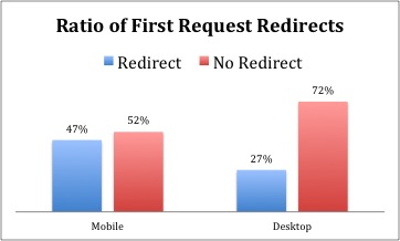
The chart clearly shows two things:
- Many websites use redirects. Even on desktop that rate is 27%.
- Practically half of websites redirect first requests on Mobile. A lot.
While informative, this chart is still missing data. Clearly websites redirect for more reasons than just mobile, so this view still doesn’t tell us how many redirects happen because of mobile. Which brings us to Test #2.
Test #2: Redirects on Mobile ONLY
Using HTTP Archive, we can correlate the HAM & HA results and see which URLs were redirected only on mobile. This means the website did not redirect first requests from Chrome, but did redirect first iPhone requests.
Here’s a pretty chart showing % of sites that redirect only on Mobile across all 5K HAM websites and only the top 100:
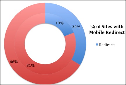
As you can see, indeed practically the full 20% gap we saw before is explained by mobile redirects. It appears that 19% of websites redirect to a mobile website while 81% do not. Looking at the top 100 websites, which are often more sophisticated, a grander 34% redirect on mobile only.
It’s worth noting that very few websites redirect only on desktop – less than 2%. And in fact, 90% of those sites were Google domains, redirecting Chrome to HTTPS (with SPDY) while letting iOS Safari remain on http.
So now we know that 81% of websites serve the same URL to desktop and mobile. However, that’s a far cry from saying 81% are responsive. Since, as mentioned above, it’s hard to tell which ones are responsive, we need to resort to other techniques.
Test #3: Mobile only redirects, over time
Since Responsive design is only 3 years old, one way to determine its adoption is to look at the rate of mobile only redirects across time. This approach assumes very few websites were responsive 2.5 years ago, when HAM started measuring, and so we should expect fewer redirects over time.
Here’s a chart showing the % of mobile-only redirects between September 1st, 2012 and November 1st, 2013, for the top 5,000 websites, measured by HAM:
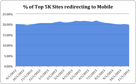
As you can see the % of mobile redirect has barely changed over this year and a bit. It does go from 20% to 19%, but that seems to be within the regular variability of the data.
This is pretty disappointing. It hints to me that no substantial number of websites has dropped their mobile-only websites in favor of a one-web site. As mentioned before, it’s not a clear-cut statement about going responsive, but I see it as a decent indicator.
You may have noticed this data is only for 14 months, while HAM is actually tracking sites for almost 2.5 years. The challenge is that the number of websites HAM is tracking has changed, going from 1,000 sites in June of 2011, to 2,000 sites in November that same year, to the current 5,000 websites in September of 2012.
Here’s the chart showing the % of mobile redirects across that entire time period, along with a layover of the number of sites tested:
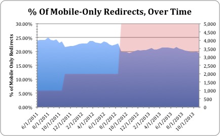
As you can see, the percentage of mobile-only redirects slightly decreases with each increase of the number of URLs. This matches what we’ve seen in test #2, where that number was far higher on the top 100 websites than across all 5,000. In addition, the % of redirects remains similar across each period of time with the same number of URLs.
Summary
It’s a bit hard to tell whether to be happy or sad about the 20% number. There are definitely some responsive website amongst the remaining 80%, and one can hope it’s a big number…
However, the lack of change over the last 14 months tells me that the so-called “Responsive Revolution” is not upon us yet. Not even close. In fact, it doesn’t look like there has been any real progress in mobile readiness over the last 14 months, with the % of mobile redirects neither increasing nor decreasing.
I pointed out multiple times during the post that this isn’t a perfect view on the adoption of responsive design. Some websites choose to make their dedicated mobile website responsive, while others may switch from having no mobile website to responsive. In addition, it’s possible that the number of websites going from mdot to responsive is roughly the same as those moving from no mobile website to having a mobile site.
Still, I find this metric to be an interesting one, and it does represent the adoption of the “One Web” concept. I plan to track it over time, and see how it evolves.