A few weeks ago I posted the results of a research testing the top 10,000 websites for responsive indicators. The test showed roughly 12% of these sites were responsive, a ratio that was fairly consistent across the top 100, 1,000 and 10,000 sites.
Following twitter feedback, I reran the test on the top 100,000 (!!!) websites as well, and dug deeper into the websites flagged as responsive – this post shares the results.
What qualifies as a Responsive site?
The previous test results triggered a fair bit of conversation about what qualifies as a responsive website. Posts by Brad Frost, Jason Grigsby and Tim Kadlec discuss this in depth, so I won’t spend too much time on it. For the purposes of this blog, I consider websites using Fluid Design to be responsive (using the test described in the last post). Since fluidity is a minimum requirement for responsiveness, these results are an upper bound on the number of responsive websites out there.
In addition, I noticed a disproportionate chunk of error responses was flagged as responsive. Logically these responses are indeed fluid, as they adapt to the display size, but I wouldn’t really count them as valid pages. To mitigate this issue, I filtered out any website that had less than two “200 OK” responses. This filter eliminated some responsive error pages, but for the most part seemed to clean the results.
Lastly, note that while I’m saying “Responsive Sites”, I actually mean “Responsive Home Page”. I’m only testing the home page of each domain, and am assuming the rest of the site is equally responsive or not.
Ratios Hold: 11-12% of sites are Responsive
Let’s get to the numbers.
At a high level, the results I’ve observed in the top 10,000 websites held in the top 100,000 as well. The following table & chart shows the ratio of RWD sites in different website tiers.
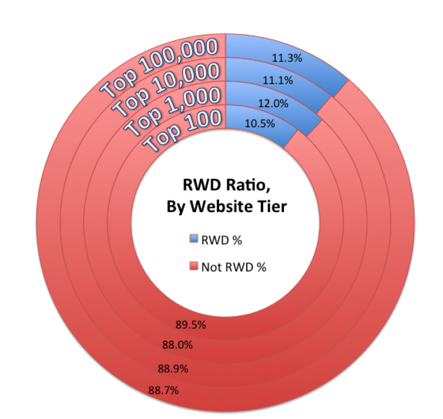
| # RWD Sites, by Tier | Responsive | Non-Responsive | RWD Ratio |
|---|---|---|---|
| Top 100 | 10 | 85 | 10.5% |
| Top 1,000 | 115 | 842 | 12.0% |
| Top 10,000 | 1,048 | 8,414 | 11.1% |
| Top 100,000 | 10,510 | 82,326 | 11.3% |
As you can see, the ratio holds quite well across the different tiers, although it’s a bit stronger in the top 1,000 websites. Roughly every 9th site is marked as responsive, both on the hotetst sites and the long tail of the web.
Hmm… 85+10 = 100?!
The math geeks amongst you may have noticed a few of the numbers don’t add up. The Responsive & Non-Responsive counts sum up to less than the “Top X” number – for example in the top 100, we only account for 95 sites. In addition, the ratios are a bit different (by roughly 1%) than the results I shared last month.
Both of those deltas are due to the filtering of broken pages I mentioned above. In the top 100 sites, 5 sites were filtered. In the top 100,000, over 7,000 sites were filtered. If you’ve ever tested a bulk list of URLs, you’d know that’s a pretty common error rate. Since many error pages were marked as responsive, the RWD ratio actually dropped by roughly 1% once the data was cleaned up.
What does this mean?
This test implies Responsive Web Design is no more prevalent on the long tail than it is in the top sites. This may surprise some, since RWD is touted as – amongst other things – a lower cost way to tackle mobile, and so the adoption in the long tail could have been bigger.
In addition, it means there are over 10,000 responsive websites out there. Some people may think that’s slow progress for a 3.5-year-old concept, but I think it’s actually a pretty impressive reach. We don’t know how quickly we got to this point, but at least we can track its adoption going forward.