A few weeks ago I tested (again) nearly 500 responsive websites in different resolutions. My test was focused on size differences between resolutions, but looked at the overall page size as a single unit.
In this blog post, I’d like to dig into the same data, but this time drill down into the specific types of resources on the page – Image, JavaScript, CSS and HTML files. Such a drill down can give us better insight into which optimizations are being applied today, and help guide us regarding where to focus our performance evangelism.
RWD Page Size
The average size of an RWD site ranged from 1,187 KB on the largest screen to 1,093 KB on the smallest one. The next chart shows those page sizes split into the four primary content types mentioned above, plus an “other” category to capture the rest.
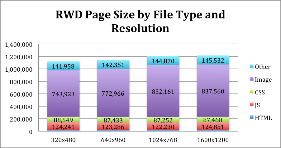
As you can see, the overall size doesn’t change much, which was the point I made in the previous post, so I won’t fret over it too much now. However, the chart captures some new interesting tidbits, which I’ll go over in the next few sections.
It’s worth noting that while I’m only digging into 2013 data here, most of the observations seem to hold true for the data I collected in 2012.
Images make up the vast majority of bytes
As expected, and matching the trend we see across all websites, images make up the bulk of the bytes. Images account for about 6x the average weight of JavaScript files, and 9x that of CSS.
Images are also consistently the biggest component on a page, regardless of screen size. This implies optimizations like Responsive Images, which deliver smaller images to smaller screens, are not being applied.
Only images are optimized to screen size
Across resolutions, the only resource type that truly changes in size across resolutions is image. CSS, HTML, JavaScript and the (tiny amount of) HTML all stay the same across resolutions.
I see this as an obvious sign of inefficiency. Consider the complexity of the “mobile” view (on most RWD sites) compared to that of their “desktop” view. In many cases, the number of interactions or widgets on the page is much smaller, and yet the same amount of HTML, JS & CSS is delivered (and processed) to all screen sizes.
Clearly images are not optimized well enough either, as mentioned in the previous section, and given their size images are probably still the first thing to optimize. However, compared to other resource types, images are miles ahead.
RWD sites are “lighter” than regular desktop websites
Even on the largest resolution, the average page weight in this test suite is ~1.2 MB. This is quite small compared to the overall ~1.4MB average page size, and almost on par with the average home page size of the top 100 websites.
Given the performance issues on the smaller screen, I wouldn’t claim RWD developers are more performance aware than average. However, RWD does force you to think about what’s really needed on your page, which can lead to less clutter on the page – and thus fewer bytes.
And of course there is the possibility the sites inventoried by http://mediaqueri.es/ are not representative enough to compare to the bigger list of websites HTTP Archive tracks. Until we have more known RWD sites we don’t have much we can do about this concern, except take some of the comparisons with a grain of salt.
RWD sites use less JS and more CSS than average
Somewhat surprisingly, only ~10.5% of page bytes (on average) came from JS files, compared to ~15% on websites in general. The gap sounds even bigger in absolute numbers – an average RWD site uses ~120KB of JS instead of the overall average of ~220KB. This may again be attributed to the more minimalist design, or perhaps the need to make these sites work across more old mobile browsers – thus relying less on JavaScript.
However, RWD sites compensate for that with CSS weight, which accounted for 7.5% of RWD site page bytes, compared to 2.5% or less on websites overall. Despite being smaller overall, the average RWD site packs 85KB compared to the 36KB an average website uses – roughly 2.5x more. This part is not surprising at all, as much of RWD relies on CSS, and browser compatibility often requires duplicating CSS content, but it seems to be an area to improve in.
Comparing Requests
Since performance is made up of more than just byte download, this second chart outlines the average number of requests per resolution, again split by content type.
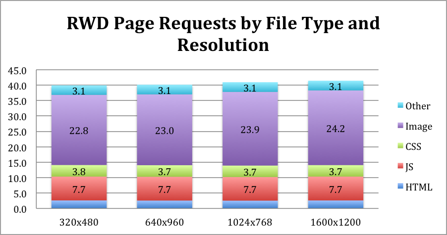
This chart mostly reinforces the insights I mentioned above:
- Total number of requests doesn’t change much across resolutions
- Images make up the majority of requests, by a large margin (though not quite as large as the gap in bytes)
- Average total number of requests – roughly 41 – is quite low compared to the overall average of 91.
- Total number of JS requests is almost half the average number
Unlike what we’ve seen with bytes, even the number of CSS requests is lower than the overall average of 5, though higher than the top 100 average of 2.7. In other words, RWD sites seem to have bigger CSS files, not more of them.
Seeing that the average RWD site uses only 41 requests is encouraging, though it could also imply complex websites don’t feel like RWD is a valid option for them. Another explanation could be that current RWD implementers are – on average – better developers & designers. RWD is still a new trend, and talented teams are more likely to be early adopters, making today’s numbers better than what they’ll be in the future.
Image Optimization – Requests vs. Bytes
RWD image optimization focuses on two main areas:
- Not downloading hidden images
- Downloading smaller images on smaller screens
I was curious to see if websites implement one of these more than the other. To check if that’s the case, I plotted the number of image bytes and image requests side by side, across the different window sizes.
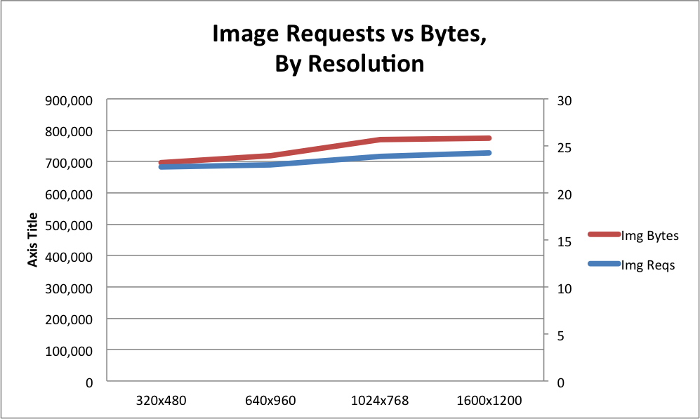
You’d notice the two lines are quite cleanly aligned. This indicates (though it’s hardly scientific proof) that both optimization aspects are equally popular – though calling either popular is a stretch, as most websites don’t apply either.
I would suspect most RWD sites either optimize images or not, but if they do – they optimize both aspects. Helping this theory is the fact most responsive images tools, like PictureFill, also implicitly avoid handling hidden images.
Summary
This data gives us some good further insight into the state of RWD websites today. We can now say that:
- The push for using responsive images is reaping some fruit. There’s still plenty of work to do before we’re in a good spot, but we’re making progress.
- **Pretty much all other aspects of RWD websites, are not optimized **to screen size. We should further evangelize serving just the right amount of HTML, JS and CSS to clients, and build supporting tools.
- It’s possible that RWD naturally helps reduce clutter and thus make web pages leaner. While not a factual statement, the data we currently have points
Remember that these conclusions, and for that fact all of these data, refer to the state of RWD today. It doesn’t mean responsive websites always behave this way, it just indicates what is actually happening in implementations today. I’ll keep tracking them, to help point out how we’re doing, and where we should focus our attention next.